by
S.
At the moment I am steeped in
Tell a Demon background art, so I thought I would write my thoughts about background art in general, including some of my past experiences (and errors).
1.
Telling a Story
Background art can say a lot about the characters who inhabit it, whether it's an interior or exterior.
All exteriors in
Tell a Demon and
Asher, for example, are intended to give hints about the world, from the old stone foundations to the altars visible on every street corner.
 |
| From Tell a Demon (Demo). |
Background art in a visual novel takes on the role of background description in a regular novel; where a book might tell you about the street altars, the design of the theater, and the style of doors most popular in a fictional city, the background art does that in a visual novel without having to tell you.
Background art can also be integrated into the story or gameplay: such as in adventure- or hidden object- type scenarios. For instance, one of the backgrounds in a visual novel I worked on,
Sunrise, had an airplane that could be added or removed. It later played a key role toward the end of the story.
2. Contrast in Style
It's important that characters stand out on the background art. One way to achieve this is through contrast in style.
It's fairly common to see a visual novel with cartoon characters on painted backgrounds, but the reverse also works to make the characters pop off the background:
 |
| From Sunrise. |
Here the background art is abstracted, flat, and saturated, in contrast to the realistic, painted, and less saturated character art.
The difference in style doesn't have to be so dramatic, but even a slight difference, such as a change in line quality, can help make the characters stand out.
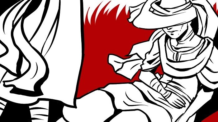
3. Contrast in Value
 |
| From Asher, god this art is old. |
One issue I had with the painted black and white art style of
Asher was getting the character art to stand out no matter where it was placed on the background art. I found that backgrounds with a wide range of values (light, middle, and dark points) often had places in which the character art blended in or disappeared!
To counter this problem, I made the backgrounds a middle-grey to light tone. I also upped the contrast in the sprite art, exaggerating highlights and shadows to establish more contrast.
This can be a problem with color art, too, and it helps to occasionally look at the artwork in grayscale to check whether or not the image holds up in black and white. This is important when designing for a wide range of viewers, since a shift in color that looks fine on one monitor might be difficult to see on a monitor with poor color calibration, and what looks distinct to one person's eyes might be indiscernible to someone with, say, color blindness.
4. Remember the Textbox
I'll admit to having a mild obsession with the textbox. I have thought of putting it at the top of the screen, where it would be out of the way. I have thought of using a subtitle style and doing away with it altogether. It seems like I often have to choose between hiding something important or adding more art (which is time-consuming) to get around the Textbox Problem.
Some of my early attempts were simply poor planning and
Asher's background art was generally awkward as I figured out what I was doing, and it suffered from several art and textbox clashes:
 |
Actually, the textbox is there to cover up the spoiler. |
I came up against this problem with the
Sunrise sprites, too. Because the sprites took such a long time to paint, it was difficult to add poses. Fairly early on in the story, a bird cage was required. There are two natural ways to carry a bird cage: from the top, or by holding it at the bottom*. While the latter would avoid the textbox issue, it would require significant repainting. However, the bird cage is only held like this for a brief period of time, and the character inside it has her own side sprite to compensate, so I settled on minimally repainting one arm pose to get the bird cage to work.
Ever since
Asher, I draw my background art thumbnails and sketches
with the textbox. Anything important has to go above that point and it's easier if it's planned in advance.
5. Focal Point
If there is an aspect to the background that you want to draw the reader's attention to, create a focal point. Here, the converging lines and lighting draws the attention to the center of the composition.
This doesn't have to apply only to items in the background, but can be used to make the characters stand out on the background:
In the above screenshot, the darkest part of the background is behind the lightest element (the character), creating a high contrast focal point. There is also nothing to compete with the reader's interest (read: this background is boring). Sometimes it's better if some backgrounds do not draw attention, because focus is then placed on the character art.
It's also worth noting that if a character is placed on a
background which is very dark, it's better if it's not a flat
#000000. One thing that can add extra polish to a VN are custom light and dark screens that match the overall feel and texture of the visual novel.
*You could also hold it from the sides, but then the bird of prey inside might take a finger.